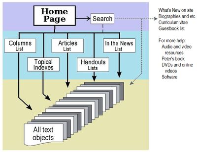
Website structure
The structure of this website is shallow but broad. There are three levels:
- the home page level
- the lists and indexes level
- the “text object” level
There is a separate group of assorted pages including various bios of Peter, his c.v., and other resources such as his book and software that don’t actually fit on any one level. All are linked off the home page. The search function, available at the top of every page including this one, searches the whole site.
Colophon and discussion
Why so much text?
This site is intended as a “brain dump” from Peter Sandman; as he wrote in a guestbook comment:
The website would be a lot easier to use if everything I write were shorter. That’s the repository thing again. My thinking goes something like this: “If I give two examples instead of five, the other three will be gone forever!”
Why no bells and whistles?
Two reasons: the first is that many of Peter’s readers are overseas, and many are in places where high-speed internet and the latest-greatest computer gear are hard to come by. The information must be accessible by people using phones, small old computer screens, and/or really slow dial-up connections. Also, for accessibility reasons, the pages must be usable by text-based readers and screen readers.
The second reason is that I’m a technical editor by trade, not a web designer or developer. When we began this site, my skills were entirely adequate for what Peter wanted, and what the web allowed. Now, many years later, my skills have been outpaced to a sizeable degree by the inexorable progress of the web.
“Browser wars”
Starting in 2009, I have redone the site using HTML4 and CSS2, trying to make sure everything is compliant with both standards and validates to the standards. Many older browsers are not CSS compliant. This site works in standards-compliant browsers (for example, Firefox and Opera), but only partially in the Microsoft browsers to various levels, depending on how standards-compliant the version of Internet Explorer is.
To the extent I am capable of, I have tried to make the site, at the lowest level, functional (Microsoft Explorer 6 and 7), and have it also look nice (MSIE 8 and all the compliant browsers).
Acronyms and Initialisms
Why are you bothering to define acronyms everyone knows, like ASAP, CEO, and CNN?
It was our decision to err on the side of too much rather than not enough. English readers will glide right over an initialism such as “PR” without even thinking about it. However, because Peter has a great many readers whose first language is not English, we’ve added definitions to acronyms and initialisms. I hope the “definition here” coding is unobtrusive enough to not bother readers, while still being noticeable enough to help those who may not casually use the acronym or initialism.
Site development
I used MacroMedia’s Homesite (ver. 5) as my HTML and CSS editor; XnView, The GIMP, and Corel’s Presentations for such limited graphics work as I was able to handle, and Firefox as my main browser. Thanks to Chris Pederick for the Web Developer toolbar for Firefox, without which I could not have done this!
Trying to suit both PC, Mac, and Linux, and as many browsers, phones, and other net-capable devices as I can, I used these fonts:
- Serif: Palatino Linotype, Bookman Old Style, Georgia, and Bitstream Charter.
- Sans-serif: Calibri, Century Gothic, Corbel, Bitstream Vera Sans, and Arial.
Copyright © 2010 by Elenor Snow, webmaster

